What Color is Replacing Gray in 2026
What Color is Replacing Gray in 2026
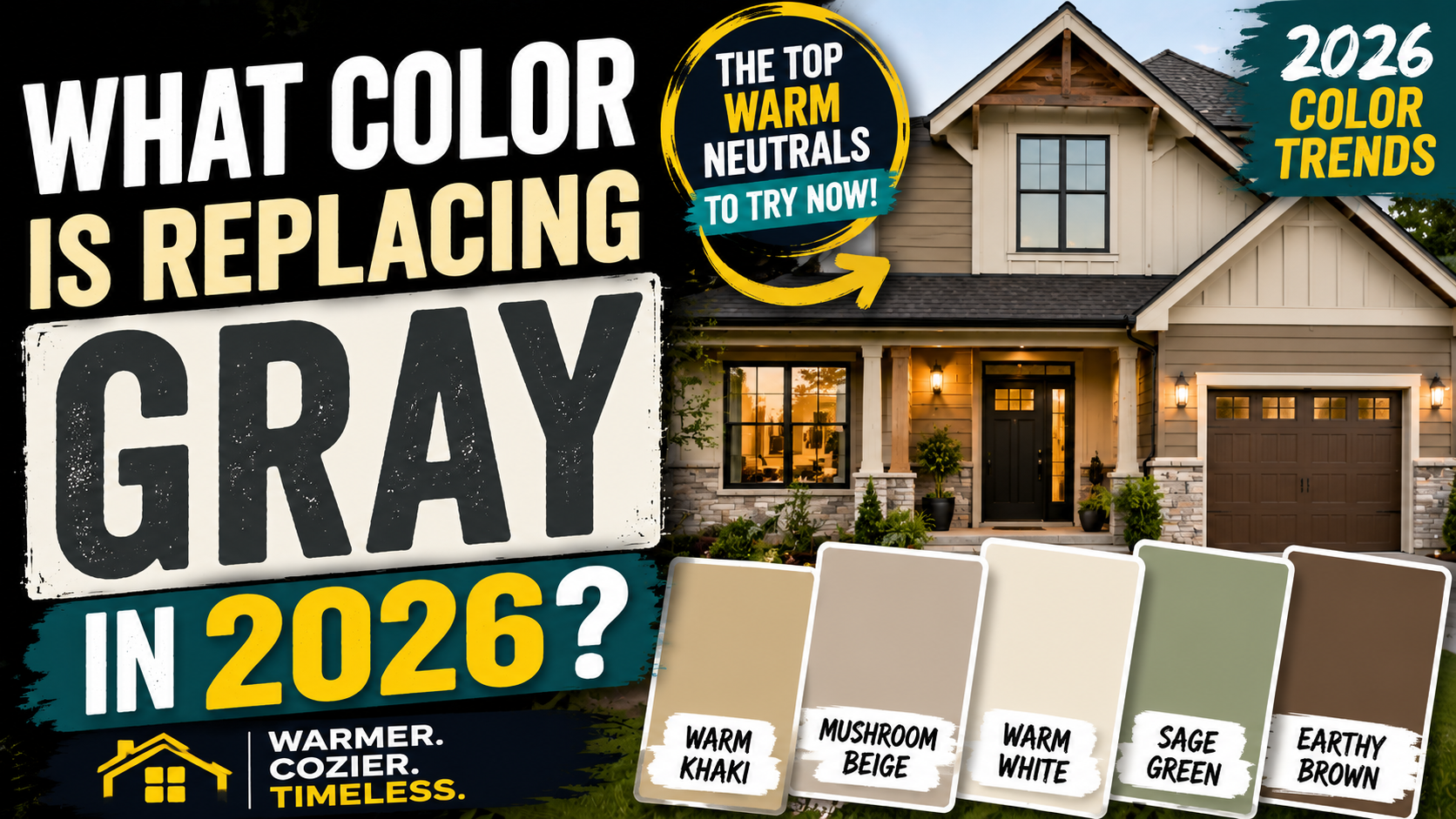
What Color Is Replacing Gray in 2026?
Introduction: Gray Is Not Gone, but the Mood Has Changed
For years, gray was everywhere.
Gray walls. Gray cabinets. Gray flooring. Gray sofas. Gray exteriors. Gray kitchens paired with bright white trim.
It became the default answer for homeowners who wanted something modern, neutral, and easy to coordinate.
In 2026, that formula is changing.
Gray has not vanished. It has simply lost its monopoly.
The design world is moving away from cool, steely, blue based gray and toward warmer colors that feel softer, calmer, and more connected to natural materials.
Think less cold concrete.
Think more stone, clay, wood, linen, sand, leather, and earth.
So What Color Is Replacing Gray in 2026?
There is not one universal replacement.
The strongest shift is toward warm neutrals.
That includes warm white, beige, greige, taupe, mushroom, khaki, muted green, caramel, brown, clay, and soft earthy pink.
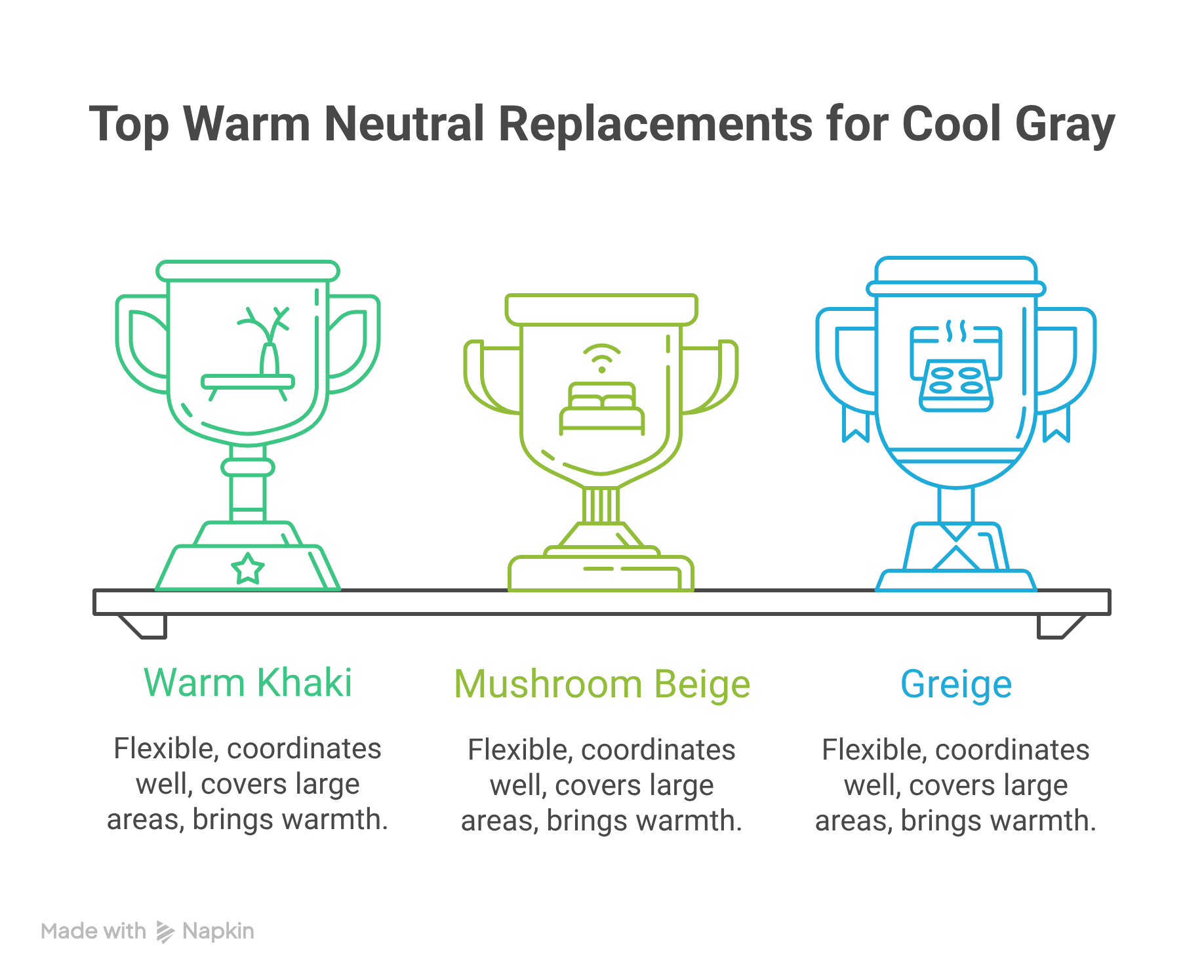
If you want the simplest answer, warm khaki and mushroom beige are two of the clearest colors replacing cool gray in 2026.
They offer many of the qualities that made gray popular in the first place.
They are flexible.
They coordinate with many materials.
They can cover large areas without overwhelming a room.
But they also bring something gray often struggled to deliver.
Warmth.
Warm Khaki Is Having a Serious Moment
Khaki has moved well beyond its association with clothing or traditional beige interiors.
Modern khaki sits somewhere between beige, tan, taupe, and muted green.
That complexity makes it useful.
Sherwin Williams and HGTV Home by Sherwin Williams selected Universal Khaki as a major 2026 color direction, reinforcing the broader movement toward grounded neutrals.
The appeal is easy to understand.
Khaki works beautifully with natural wood, cream, stone, black accents, leather, muted green, and warmer metal finishes.
It feels neutral without looking lifeless.
Mushroom Beige Offers an Even Softer Transition
Mushroom is another major contender.
It blends beige, taupe, gray, and brown into one understated shade.
For homeowners who have spent years surrounded by gray, mushroom can feel like an easy next step.
It is warmer without becoming obviously beige.
It has depth without demanding attention.
It works especially well with wood flooring, stone, warm white trim, and natural textures.
That makes it useful for living rooms, bedrooms, kitchens, hallways, cabinetry, and even exterior palettes.
Gray Is Not Suddenly Outdated
This distinction matters.
Gray itself is not the problem.
Cool gray used everywhere is what has started to feel tired.
A warm gray can still look sophisticated.
Greige remains highly practical.
Gray green can feel fresh.
Charcoal can still create excellent contrast on doors, cabinetry, roofing, and exterior details.
The question in 2026 is less about whether a color is technically gray and more about what undertones it carries.
Warmth is winning.
The Shift Is Reaching Home Exteriors Too
This trend is not limited to living rooms and kitchens.
Exterior palettes are warming as well.
Homeowners are increasingly looking at mushroom siding, warm greige, khaki, creamy white, soft taupe, muted green, and brown based accents.
That matters because exterior color works differently from interior paint.
A wall can be repainted in a weekend.
Siding, roofing, windows, doors, and trim may stay in place for many years.
The entire exterior needs to work together.
For Illinois homeowners, Sunrise Exterior can help make that bigger picture easier to understand.
Instead of choosing a siding color because it happens to be fashionable, the smarter approach is to consider the roof, brick, stone, windows, doors, gutters, landscaping, and architectural style as one complete palette.
A home should feel current.
It should not feel trapped inside a trend.
Why Is Gray Being Replaced in 2026?
Gray became popular for good reasons.
It looked clean.
It worked with many decorating styles.
It paired easily with white, black, stainless steel, marble, and modern furniture.
It also offered homeowners an escape from the yellow beige palettes that dominated many older interiors.
Then everyone discovered gray.
And everyone kept using it.
Eventually, neutrality became uniformity.
Cool Gray Started Feeling Cold
The biggest issue is not simply that gray became common.
It is how certain grays affect a room.
Cool gray often contains blue or violet undertones.
In the right environment, that can look crisp and sophisticated.
In the wrong environment, it can make a room feel chilly.
North facing rooms can make cool gray feel even cooler.
Limited daylight can make it appear flat.
Cool flooring combined with cool gray walls and stark white trim can make an entire room feel harder and less welcoming than intended.
That effect is part of what homeowners and designers are moving away from.
People Want Homes to Feel Warmer Again
The new neutral palette reflects a larger change in how people think about interiors.
A home is not simply supposed to look polished.
It should feel comfortable.
That means softer contrast.
Warmer undertones.
More texture.
More natural materials.
More visual depth.
Warm beige, mushroom, khaki, taupe, and muted green support that atmosphere naturally.
They make wood look richer.
They soften stone.
They pair comfortably with woven materials.
They work with aged brass, leather, linen, wool, and handmade finishes.
The result often feels less manufactured and more lived in.
Natural Materials Are Driving the Palette
One reason warm neutrals are becoming stronger is that natural materials are becoming more prominent.
Oak flooring does not always look its best beside icy gray.
Neither does warm brick.
Neither does cream stone.
Neither does walnut cabinetry.
Warm neutral colors allow these materials to become part of the palette instead of fighting against it.
A mushroom wall beside natural oak can feel cohesive.
Khaki beside stone can feel grounded.
Muted sage beside warm wood can feel calm and intentional.
The color does not need to dominate.
It simply needs to belong.
Homeowners Want More Personality Without Giving Up Neutrality
Gray solved one problem brilliantly.
It was safe.
The problem is that safe can eventually become anonymous.
The 2026 palette gives homeowners a way to stay neutral while introducing more personality.
Mushroom has character.
Taupe has depth.
Khaki feels earthy.
Muted green brings subtle color.
Espresso brown creates mood.
Warm white feels softer than stark white.
None of these colors require a homeowner to commit to something loud.
They simply provide more dimension.
The New Neutral Is Not Really One Color
This may be the most important part of the trend.
Gray is not being replaced by another single dominant shade.
The neutral category itself is becoming wider.
A homeowner can choose warm white for one room, mushroom for another, muted green for cabinetry, and espresso for an accent.
The palette can still feel cohesive because the undertones relate.
That creates something gray interiors often lacked.
Layering.
Exterior Design Is Following the Same Direction
The same desire for warmth is appearing outside.
Cool gray siding paired with bright white trim remains common, but homeowners increasingly have other options.
Warm taupe.
Mushroom.
Khaki.
Cream.
Muted green.
Brown.
Warm greige.
These colors can work especially well with brick, stone, darker roofing, bronze windows, and natural landscaping.
For Illinois homes, that flexibility is useful because exterior materials often need to coordinate with architecture that already has strong character.
Brick cannot simply be ignored.
Neither can the roof.
Neither can permanent stonework.
Sunrise Exterior can help homeowners look at those fixed elements before choosing new siding, trim, roofing, windows, or doors.
That is the bigger lesson behind the 2026 color shift.
Gray is not being rejected because it suddenly became ugly.
Homeowners are simply asking for more.
More warmth.
More depth.
More connection to natural materials.
More personality.
And in 2026, warm neutrals are answering that call.
The Short Answer: Warm Khaki and Mushroom Beige Are Leading the Shift
If you want the cleanest answer to what color is replacing gray in 2026, start here.
Warm khaki and mushroom beige are two of the strongest contenders.
Both colors keep the flexibility that made gray so popular, but they feel softer, warmer, and more grounded.
They do not shout for attention.
They do not overpower furniture or architectural details.
They simply give a room more life.
Why Warm Khaki Works
Warm khaki sits somewhere between beige, tan, taupe, and muted green.
That mix gives it range.
It can feel earthy in one room and sophisticated in another.
It works with natural wood.
It works with cream.
It works with black.
It works with stone.
It can also bridge traditional and modern interiors without looking trapped in either style.
That is exactly why it feels so current.
It still behaves like a neutral.
It just feels less cold than gray.
Why Mushroom Beige Works
Mushroom beige is slightly softer and more subdued.
It usually contains a mix of beige, taupe, brown, and a touch of gray.
The result is a neutral that feels layered rather than flat.
For homeowners who are tired of cool gray but nervous about moving fully into beige, mushroom can be an ideal transition.
It keeps some of gray's restraint while introducing warmth.
That makes it especially useful in homes with a mix of old and new finishes.
These Colors Feel Modern Without Feeling Trendy
That distinction matters.
A good neutral should not feel like it belongs to one specific year.
Warm khaki and mushroom beige feel current because they support the larger move toward natural materials and warmer interiors.
But they are also restrained enough to age well.
That makes them more practical than an aggressive trend color that may feel dated quickly.
They Also Work Beyond Interior Walls
These shades are not limited to living rooms or bedrooms.
Warm khaki and mushroom can work beautifully on cabinetry, doors, built ins, and larger architectural surfaces.
They can also translate well to home exteriors.
A mushroom siding color paired with warm white trim and a dark roof can feel sophisticated without being dramatic.
Warm khaki can work especially well with brick, stone, wood accents, and darker roofing.
For Illinois homeowners, Sunrise Exterior can help coordinate these warmer exterior colors with the materials that are already part of the home.
The best result usually comes from choosing a palette, not one isolated color.
Warm Khaki May Be the Most Headline Friendly Gray Replacement
Warm khaki is one of those colors that sounds ordinary until you see what it can do.
It has enough beige to feel approachable.
Enough brown to feel grounded.
Enough muted green to keep it from looking too yellow.
That balance gives it the versatility homeowners once looked for in gray.
Why Khaki Is Getting So Much Attention
Sherwin Williams and HGTV Home by Sherwin Williams selected Universal Khaki as a major color direction for 2026.
That choice reflects a broader movement toward neutrals that feel more natural and less clinical.
Khaki fits that shift perfectly.
It is not bright.
It is not dramatic.
It is not trying too hard.
It simply feels warm, useful, and adaptable.
Khaki Works With the Materials People Already Love
One reason khaki feels so relevant is that it pairs naturally with the materials showing up in more homes.
Natural oak.
Walnut.
Stone.
Leather.
Cream.
Aged brass.
Black accents.
Terracotta.
Olive.
Muted blue.
These materials and colors all benefit from a neutral that supports them rather than competing with them.
Cool gray can sometimes make warm wood look orange or disconnected.
Khaki usually does the opposite.
It brings the room together.
It Can Work Throughout the Home
Khaki is flexible enough to appear in several rooms without making the house feel repetitive.
It can work in a living room.
A bedroom.
A hallway.
A kitchen.
On cabinetry.
On doors.
It can even function as a whole house neutral when the undertone is right.
That makes it useful for homeowners who want consistency without falling back into another all gray interior.
Khaki Can Work Outside Too
Exterior color is where khaki becomes especially interesting.
Warm khaki siding can pair beautifully with darker roofing, cream trim, brick, stone, and natural landscaping.
It can make a traditional home feel fresher without forcing it into a modern style.
It can also soften homes with strong black accents or darker windows.
For Illinois properties, that flexibility is valuable because many homes already include brick, stone, asphalt roofing, or other fixed materials that need to remain part of the design.
Sunrise Exterior can help homeowners look at those permanent elements before committing to a new siding or trim color.
That is important because exterior color is not chosen in isolation.
The roof matters.
The windows matter.
The brick matters.
The stone matters.
The architecture matters.
Test Khaki Before You Commit
Khaki can shift dramatically depending on light.
In one space it may look beige.
In another it may lean green.
In another it may appear more brown.
That is why testing large samples is essential.
Look at the color in morning light.
Look at it in the afternoon.
Look at it under artificial lighting.
For an exterior, observe it in direct sun, shade, and cloudy conditions.
A color that looks subtle on a small sample can feel completely different across an entire wall or siding elevation.
That extra step is worth it.
Because the best gray replacement is not simply the trendiest shade.
It is the one that actually works with the home.
Mushroom and Putty Are Replacing Flat Gray With Something Softer
Mushroom may be one of the easiest colors to underestimate.
On paper, it sounds beige.
On the wall, it can be much more interesting.
Mushroom typically combines beige, taupe, brown, and a subtle amount of gray. That mixture gives it depth without making it feel dark or heavy.
It is neutral, but not lifeless.
Why Mushroom Feels So Current
Cool gray tends to pull a room toward blue or silver.
Mushroom moves in the opposite direction.
It brings warmth while retaining enough gray influence to feel restrained.
That makes it particularly attractive for homeowners who want to update a gray interior without suddenly turning everything cream or tan.
Where Mushroom Works Best
Mushroom can work beautifully in living rooms, bedrooms, hallways, bathrooms, kitchens, and cabinetry.
It also pairs naturally with materials that are becoming more prominent in current design.
Natural oak.
Walnut.
Cream stone.
Warm metals.
Linen.
Leather.
Terracotta.
Muted green.
The result feels layered rather than overly coordinated.
Mushroom Can Work Outside Too
The same qualities can make mushroom an attractive siding color.
Pair it with warm white trim for a softer traditional appearance.
Combine it with dark brown or charcoal roofing for stronger contrast.
Use black windows for a more contemporary direction.
For Illinois homes with existing brick or stone, mushroom can be particularly useful because it often relates more naturally to earthy masonry tones than icy gray does.
Warm White Is Replacing Gray for Homeowners Who Still Want Bright Spaces
Not everyone abandoning gray wants more color.
Some homeowners simply want more warmth.
That is where warm white enters the picture.
Warm white keeps the brightness and simplicity of white while introducing subtle cream, beige, or brown undertones.
The result can feel cleaner than beige but softer than stark white.
Warm White Does Not Feel Sterile
Pure white can be striking.
It can also become harsh when combined with cool flooring, artificial lighting, or large expanses of blank wall.
Warm white softens that effect.
It works particularly well beside natural wood, stone, woven textures, warm metals, and earthy colors.
It Can Become the Foundation of the Entire Palette
Warm white does not have to be the star.
That is part of its appeal.
It can create the backdrop while mushroom, khaki, green, brown, or terracotta provide depth.
It can appear on walls, ceilings, cabinetry, trim, or exterior materials.
Be Careful With Exterior White
Exterior sunlight changes everything.
A creamy sample that appears subtle indoors can look much brighter outside.
The roof, brick, stone, windows, and surrounding landscaping can also change how the color is perceived.
For that reason, exterior samples should be evaluated on the actual house whenever possible.
Greige and Warm Taupe Are the Safest Bridge Away From Gray
Some homeowners do not want to abandon gray.
They just want it to feel warmer.
Greige exists almost perfectly for that purpose.
It combines gray with beige, creating a neutral that can coordinate with both cool and warm finishes.
Greige Solves the Mixed Finish Problem
Many existing homes contain several color generations at once.
There might be gray countertops.
Warm wood flooring.
Cream tile.
White cabinets.
Brown furniture.
Replacing the walls with a strong beige could create another mismatch.
A carefully selected greige can bridge those materials.
Taupe Adds More Depth
Taupe usually moves further into brown territory.
It can feel richer, warmer, and more substantial than traditional gray while remaining neutral enough for large spaces.
But undertones matter enormously.
Some taupes lean pink.
Others lean green, purple, yellow, or brown.
Testing is essential.
Greige and Taupe Are Strong Exterior Options
These colors can work especially well with existing brick, stone, dark roofing, black windows, bronze accents, and warm white trim.
For homeowners considering new siding, this makes them practical choices because they can connect several permanent exterior materials without forcing everything to match perfectly.
Muted Green Is Becoming a New Neutral
Green used to be the color you added to a neutral palette.
Now green can be the neutral.
Soft sage, olive, eucalyptus, smoky jade, and green beige shades are increasingly being used across walls, cabinetry, doors, and exterior accents.
Why Green Works
Green has an obvious connection to nature.
That makes it comfortable beside wood, stone, cream, brown, brass, black, and terracotta.
A soft sage can almost disappear into a room.
A deeper olive can create character.
A smoky jade can make cabinetry or an office feel dramatic without becoming overwhelmingly colorful.
Behr choosing Hidden Gem for its 2026 color direction reflects this larger appetite for nature inspired shades.
Green Has Exterior Potential Too
Muted green can be particularly attractive outside because landscaping naturally becomes part of the palette.
It can work on siding, doors, shutters, porches, and architectural accents.
The trick is choosing a green that complements the roof, masonry, and surrounding materials rather than competing with them.
Brown Is Back, but It Looks Very Different This Time
Yes.
Brown.
The color that spent years watching gray steal its job is back in the conversation.
But this is not necessarily the heavy brown interior many people remember.
The new brown palette includes caramel, camel, tobacco, chestnut, cocoa, chocolate, and espresso.
Brown Brings Depth
Where gray can feel architectural, brown often feels organic.
It reminds us of wood, leather, soil, stone, coffee, and natural materials.
That makes it particularly effective in spaces designed around warmth and texture.
Espresso Is Becoming a Powerful Dark Neutral
Benjamin Moore selected Silhouette for its 2026 color direction, a deep espresso shade with charcoal influence.
That combination says something important about where color is moving.
Even darker neutrals are becoming warmer.
Instead of automatically reaching for charcoal or black, homeowners can consider espresso brown for cabinetry, doors, built ins, dining rooms, libraries, or accent areas.
Brown Can Replace Dark Gray Outside
A deep brown door can provide contrast without the sharpness of black.
Brown accents can also connect naturally with warm siding, stone, brick, and certain roofing colors.
This can create an exterior that feels rich without looking excessively trendy.
Earthy Pink, Clay, and Terracotta Are Becoming Surprisingly Neutral
Pink as a neutral sounds contradictory until you see the right pink.
The 2026 version is not bubblegum.
It is dusty.
Muted.
Earthy.
Sometimes it barely reads as pink at all.
Clay, blush beige, dusty rose, and terracotta can bring warmth into a room without overwhelming it.
These shades pair naturally with cream, olive, brown, natural wood, aged metals, stone, and handmade tile.
For homeowners who want something more expressive than beige but softer than a saturated color, this family offers an interesting middle ground.
What Are the Major 2026 Paint Brand Color Directions?
Looking across major color selections makes the broader movement easier to see.
Brand
2026 Selection
Color Family
Direction
Sherwin Williams
Universal Khaki
Warm khaki
Grounded neutral
HGTV Home by Sherwin Williams
Universal Khaki
Sandy neutral
Warm versatility
Behr
Hidden Gem
Smoky jade
Nature inspired
Benjamin Moore
Silhouette
Espresso brown
Deep warm neutral
Valspar
Warm Eucalyptus
Muted green
Organic warmth
Pantone
Cloud Dancer
Soft white
Airy neutrality
Glidden
Warm Mahogany
Red brown
Earthy richness
Graham and Brown
Divine Damson
Deep plum
Muted expression
The interesting part is not that one company chose khaki while another chose green or brown.
It is what they did not collectively choose.
Another cold gray.
The broader direction is warmer, earthier, softer, and more expressive.
Is Gray Officially Out of Style in 2026?
No.
And painting every gray surface in your house because somebody declared gray dead would be an excellent way to chase a trend rather than create a good home.
Gray still works.
The difference is that warmer versions generally feel more aligned with the current direction.
Greige works.
Gray green works.
Taupe gray works.
Charcoal still has an important place in roofing, doors, cabinetry, and architectural details.
The question is not simply whether a color is called gray.
The question is what undertones it contains and what surrounds it.
What Is Replacing Gray on Home Exteriors?
This is where the trend becomes particularly interesting for homeowners.
Interior paint is easy to change.
Exterior materials are not.
Warm khaki, mushroom, taupe, greige, cream, warm white, muted sage, and soft brown are all strong alternatives to cool gray exteriors.
But the siding cannot be considered alone.
The roof matters.
Brick matters.
Stone matters.
Windows matter.
Doors matter.
Gutters matter.
Architecture matters.
For Illinois homeowners, Sunrise Exterior can help approach those pieces as one exterior system rather than a collection of unrelated colors.
The objective should not be finding the trendiest siding color.
It should be finding the color that makes the entire house work,
How Should Siding Color Change as Gray Fades?
Do not replace gray with random beige.
That simply trades one design problem for another.
Instead, start with the permanent materials already on the house.
Look at the roof.
Look at the brick.
Look at the stone.
Look at the windows.
Then consider warm khaki, mushroom, soft taupe, greige, cream, or muted green siding.
Sunrise Exterior can help Illinois homeowners think through how siding interacts with these larger exterior elements.
A successful exterior should feel coordinated without looking overly matched.
What Roof Colors Work With the New Warm Neutral Trend?
The roof occupies too much visual space to ignore.
Khaki siding can work beautifully with deep brown or charcoal roofing.
Mushroom can pair with weathered brown, charcoal, or soft black.
Warm white can create contrast with brown or charcoal.
Muted green often works naturally with brown, black, or warmer gray roofing.
Taupe can bridge both brown and charcoal families depending on its undertones.
Color matters.
Performance matters more.
A roof should never be selected primarily because one shade happens to be fashionable in 2026.
What Trim Colors Work With Warm Khaki, Mushroom, and Taupe?
Warm white remains one of the easiest choices.
Cream creates a softer and more traditional appearance.
Dark brown can add rich contrast.
Soft black can create a cleaner contemporary edge.
Muted green can introduce subtle character.
Existing window colors should also influence the decision.
Black, white, bronze, and wood tone windows each interact differently with siding and trim.
The strongest palette treats all of these pieces as connected.
How Should You Choose the Right Gray Replacement for Your Home?
Start with the things you are not changing.
Flooring.
Countertops.
Cabinetry.
Brick.
Stone.
Roofing.
Windows.
Then study the light.
A warm neutral can behave completely differently in morning sun, afternoon shade, winter light, or artificial lighting.
Next, study the undertones.
Beige can lean yellow.
Taupe can lean purple.
Mushroom can lean brown.
Greige can lean green.
White can lean cream.
Finally, test large samples.
A tiny card is not a wall.
And it certainly is not an entire house.
Interior Color and Exterior Color Should Not Be Chosen the Same Way
Interior paint gives homeowners freedom.
Do not like it?
Paint again.
Exterior decisions require more discipline.
Siding, roofing, windows, and doors can remain for years or decades.
That means trends should influence the decision without controlling it.
Architecture comes first.
Permanent materials come next.
Then color trends can help move the house in a more current direction.
The best exterior palette should look good in 2026 without screaming that it was chosen in 2026.
What If Your Home Already Has a Lot of Gray?
Keep it.
At least some of it.
A gray roof does not need to be replaced simply because warm neutrals are trending.
Gray countertops do not suddenly require demolition.
The smarter strategy is often to introduce warmth around existing gray.
Add mushroom.
Add warm white.
Add natural wood.
Add khaki.
Add muted green.
Add brown.
Greige can be especially useful because it connects cool and warm materials.
Outside, an existing gray roof may pair beautifully with mushroom, taupe, muted green, warm white, or warmer greige siding.
The objective is evolution, not panic.
What Colors Should You Avoid if You Want Your Home to Feel Current in 2026?
There is no forbidden color list.
Context matters too much.
But homeowners may want to be cautious about covering everything in cold blue gray.
The combination of icy gray walls, gray flooring, gray furniture, gray cabinets, and stark white trim can feel particularly flat.
At the opposite extreme, heavily yellow beige can feel dated rather than warm.
The solution is balance.
Warmth should feel intentional, not muddy.
Color should support the materials around it rather than fight them.
Does Replacing Gray Increase Home Value?
Not automatically.
Paint can improve presentation.
Updated siding can transform curb appeal.
A coordinated exterior can make a home feel better maintained and more current.
But there is no magic paint shade that creates instant equity.
For resale, broad appeal generally matters more than selecting the exact color receiving attention that year.
Warm white, soft greige, light taupe, mushroom, and restrained khaki can all provide relatively flexible backgrounds.
Condition matters even more.
Fresh paint cannot compensate for water damage.
A fashionable siding color does not make a failing roof disappear.
The fundamentals still win.
Should You Use 2026 Color Trends When Selling a Home?
Use them as guidance.
Not commandments.
Large surfaces usually benefit from restraint.
Walls, siding, and major cabinetry should generally appeal to a reasonably broad audience when resale is the priority.
Smaller areas can carry more personality.
Doors.
Built ins.
Powder rooms.
Accent spaces.
Exterior details.
The objective is to make the house feel current without making buyers feel that they are purchasing somebody else's design experiment.
Interior Gray Replacement Versus Exterior Gray Replacement
Color
Interior Use
Exterior Use
Best Pairings
Overall Feel
Warm khaki
Walls and cabinetry
Siding and accents
Cream, wood, brown
Grounded
Mushroom
Walls and cabinetry
Siding
Warm white, stone, charcoal
Soft
Warm white
Walls and trim
Siding and trim
Wood, brown, green
Bright
Greige
Whole house neutral
Siding
Brick, black, wood
Versatile
Taupe
Walls and cabinetry
Siding and trim
Cream, brown, stone
Refined
Muted sage
Kitchens and bedrooms
Siding and doors
Wood, cream, black
Natural
Caramel brown
Accents and furniture
Doors and details
Cream, green, stone
Warm
Espresso
Cabinetry and doors
Doors and trim
Khaki, cream, mushroom
Dramatic
Terracotta
Accent areas
Doors and details
Cream, olive, wood
Earthy
Why Illinois Homeowners Should Think Beyond the Paint Chip
Illinois gives color plenty of different lighting conditions.
Gray winter skies can cool a color.
Bright summer sun can intensify it.
Snow can reflect enormous amounts of light onto an exterior.
Trees can cast green tones across siding.
Brick and stone can change how neighboring colors appear.
Even texture matters.
The same general color can look different across smooth trim, textured siding, brick, or roofing.
That is why samples should be viewed in the environment where the final material will actually live.
How Sunrise Exterior Can Help Build a More Current Exterior Palette
The strongest exterior palettes begin with one simple question.
What is staying?
Maybe the roof is staying.
Maybe the brick is staying.
Maybe the stone is staying.
Maybe the windows are staying.
Those elements become the foundation.
From there, homeowners can make smarter decisions about siding, trim, doors, gutters, roofing, windows, and other exterior updates.
Sunrise Exterior can help Illinois homeowners approach these choices as a complete exterior rather than isolated projects.
That matters because the goal is not to chase every color trend.
The goal is to create a home that feels cohesive now and continues looking good after the trend cycle moves again.
The New Gray Is Warmer, Softer, and More Natural
So, what color is replacing gray in 2026?
Warm khaki and mushroom beige are two of the clearest answers.
But the bigger story is warmth.
Warm white, greige, taupe, mushroom, khaki, muted green, caramel, and brown are creating a softer and more natural neutral palette.
Gray is not dead.
Cold, flat gray simply has more competition.
For Illinois homeowners considering an exterior update, Sunrise Exterior can help coordinate siding, roofing, trim, windows, doors, and existing materials into a palette that feels current without becoming a prisoner of the latest trend.
Because the best color for your home is not simply the color of 2026.
It is the color that still looks right when 2027 arrives.
Recent Posts